Brand kit
A cozy pixel-art night diary. Colour, type, components, illustration, motion and words, as the app draws them.
Asterie 1.0 · November 2026 · drawn from the code on main
Brand kit
A cozy pixel-art night diary. Colour, type, components, illustration, motion and words, as the app draws them.
Asterie 1.0 · November 2026 · drawn from the code on main
One small page a night, written in a warm little room under the stars.
Asterie is a night diary. You write a few lines before sleep, and each night becomes a star in your sky. The room around you is pixel art: a lamp, a bed, a window full of night, and a character who lives there with you. Everything is small, warm and a little alive.
The wordmark is pixel art with its own ink outline and drop: it reads on the night and on paper. Use the supplied PNGs at whole-number scales; never retype or regenerate it.
design/asterie-v1/wordmark/ at 1x, 2x or 3x, or a whole-number multiple, with nearest-neighbour scaling.A warm night, lit by a lamp. Plum darks, paper creams and one honey for the thing to do next. Every colour is a token in AsterieColor or ChromeColor.
Mostly night. Paper where you read and write. Honey is rare on purpose: when it appears, it is the action.
Read from AsterieTheme.swift and PixelChrome.swift each time the kit is built.
#271826#3A2338#38212B#2E1C2A#030C23The room pack's quiet exterior while its first frame loads.#FCEFD6#F7E2BC#F3E4D4#C7A89C#F1D3A2#D8C3A5Pencil on paper: the unlit side of a moon drawn on a notebook page.#6B4436#7A4F45#F0B860#D4953A#F7D27A#FFEFC6#F9D98CThe header star sprite's pale gold and its white core (`sheets/sky-sprites.png`).#FFF7E1#F6E6C6#2A2650#E8A6A8#E8B4B0A soft rose for second sparkles and puffs on the night, with its pale core.#FFF6DA#B59AA6A dusty lilac between muted and the wall: small section marks on the night.#E2725BSomething can't go there: an invalid placement outline. Warm, not system red.#C25844Warn pressed in, and the base a warn button sits on.#8E3D31#1C1019#2A1824#5A362F#4A2E3E#D4953A#4A2A1CThe room's dark wood (`#4A2A1C`): the 2 pt outline round every paper card and button.#8A562AThe pressed-down base under a honey button.#7E2E36The Plus badge's rose, from the wax seal's shadow.Two faces. Pixelify Sans for names and the one hero action; Poppins for everything you read.
| AsterieType | pixel | font / medium | For |
|---|---|---|---|
.display34 pt | Goodnight, Thursday. | Goodnight, Thursday. | Arrival and celebration heroes |
.title28 pt | Your sky | Your sky | A place's name in its header |
.heading20 pt | Seven stars in your sky. | Seven stars in your sky. | Section and card headings |
.body16 pt | Tell the stars about today. | Tell the stars about today. | Prose, rows, buttons, written words |
.caption13 pt | Thursday, October 1, waxing moon | Thursday, October 1, waxing moon | Notes, labels, footers |
One style per row. Sizes follow Dynamic Type up to the app's cap, so the scale holds at every text size. scripts/check-font-sizes fails on any size named outside the theme.
Icons are drawn, not borrowed: small glyphs on the pixel grid, one or two palette colours, a highlight where light would catch.
PixelGlyph); a cell is 1, 2 or 3 pt, never a fraction.PixelSpinner).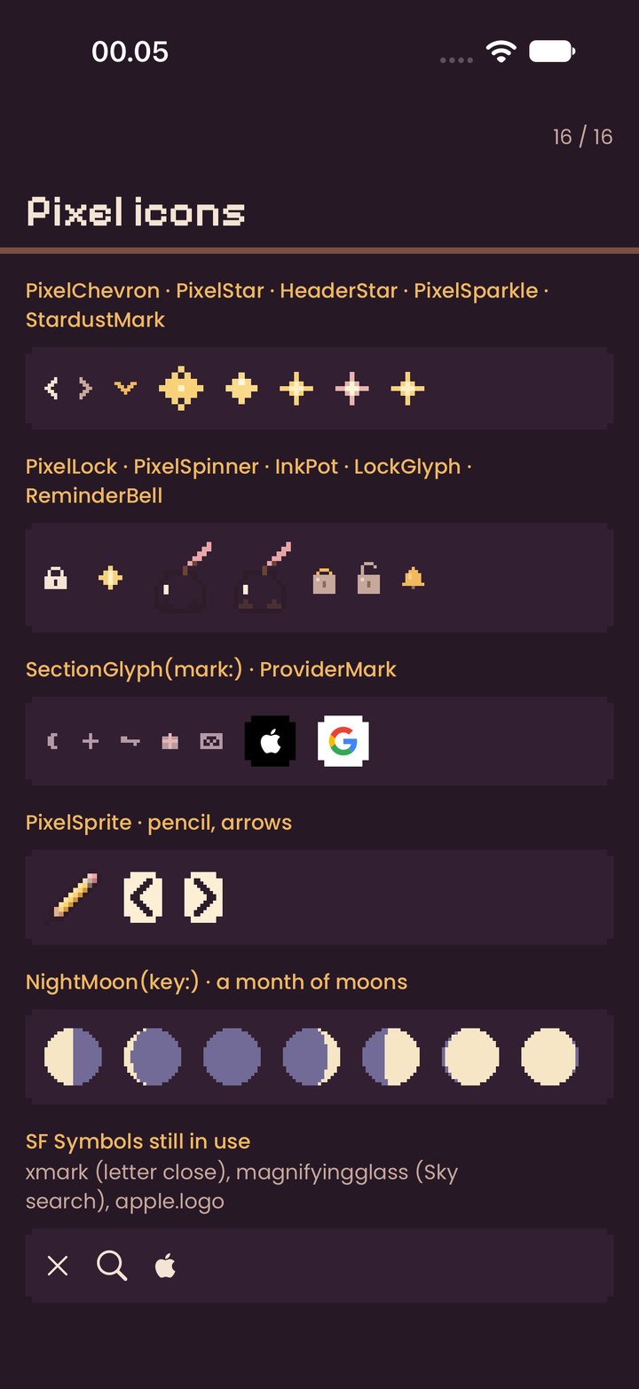
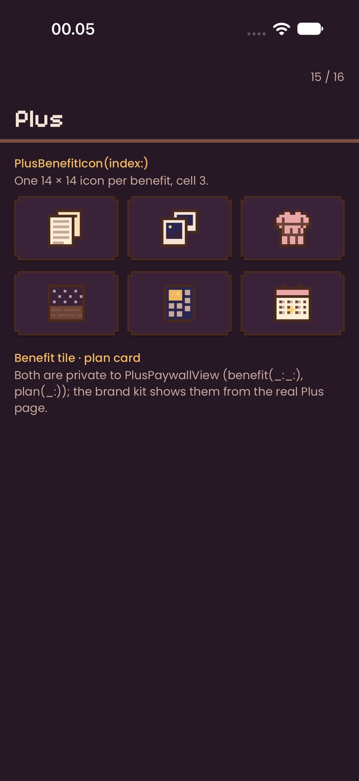
Each is drawn from the real code in the DEBUG gallery (-AsterieGallery <page>). Code names in honey.
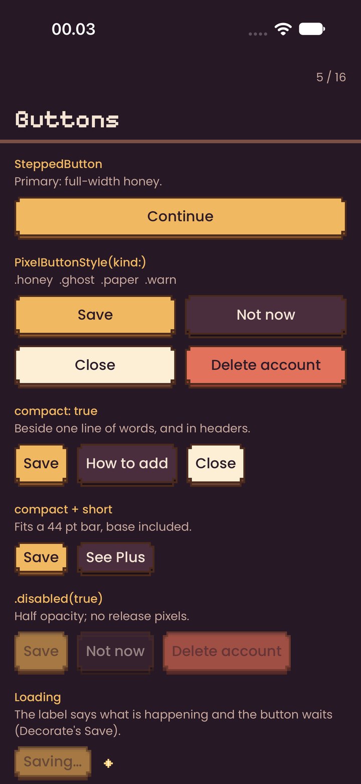
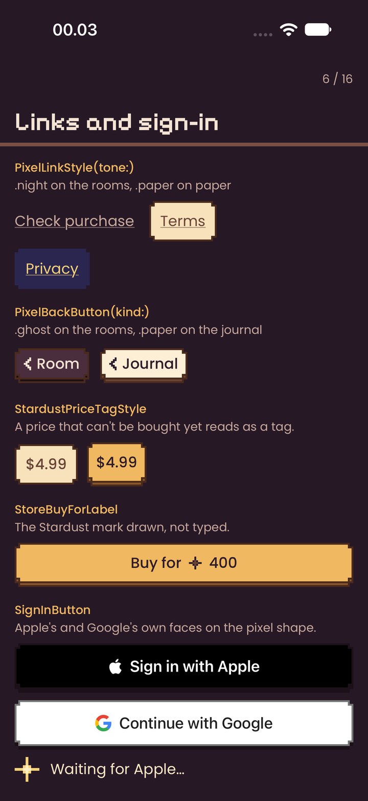
PixelButtonStyle · SteppedButton.honey · .ghost · .paper · .warn; fullWidth, compact, short; pressed sinks 4 pt; disabled at half opacity
Honey is the one action on a screen (SteppedButton: full width, at the foot). Ghost beside it on the night, paper on paper, warn only for what can't be undone.
Loadingdisabled honey with a doing-word label (“Saving…”), or PixelSpinner in place of a price
When an action is under way. Never a system spinner.
PixelLinkStyle.night · .paper · .star; underlined in its own colour, 44 pt tall
The one text link, for a quiet second way on.
PixelBackButton.ghost · .paper; chevron and the parent's name
Back, always top left, inside PlaceHeader.
StardustPriceTagStyle · StoreBuyForLabelparchment tag; honey “Buy for ✦ 400”
A price that can't be bought yet reads as a tag, not a dead button.
SignInButtonApple black, Google white, on the pixel shape
Sign-in only, in their own fonts and colours.
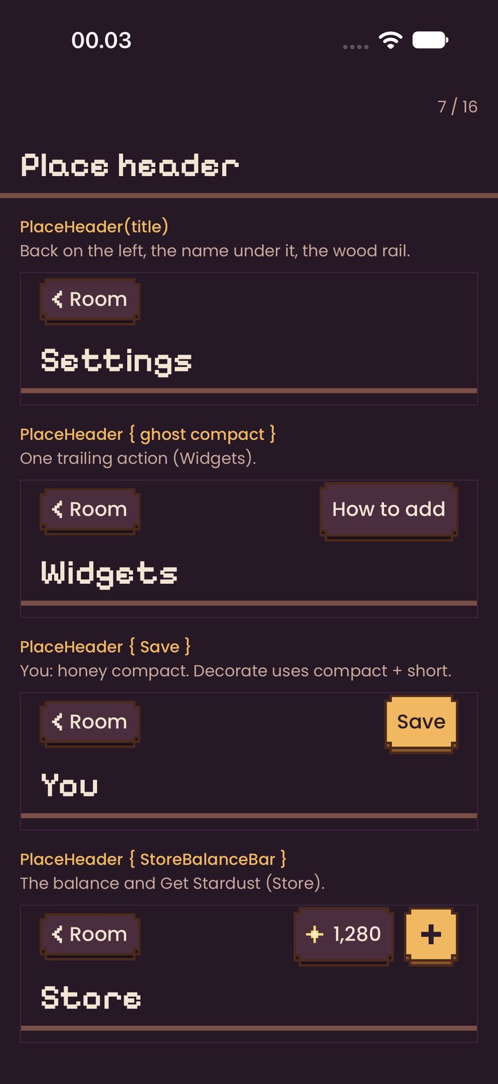
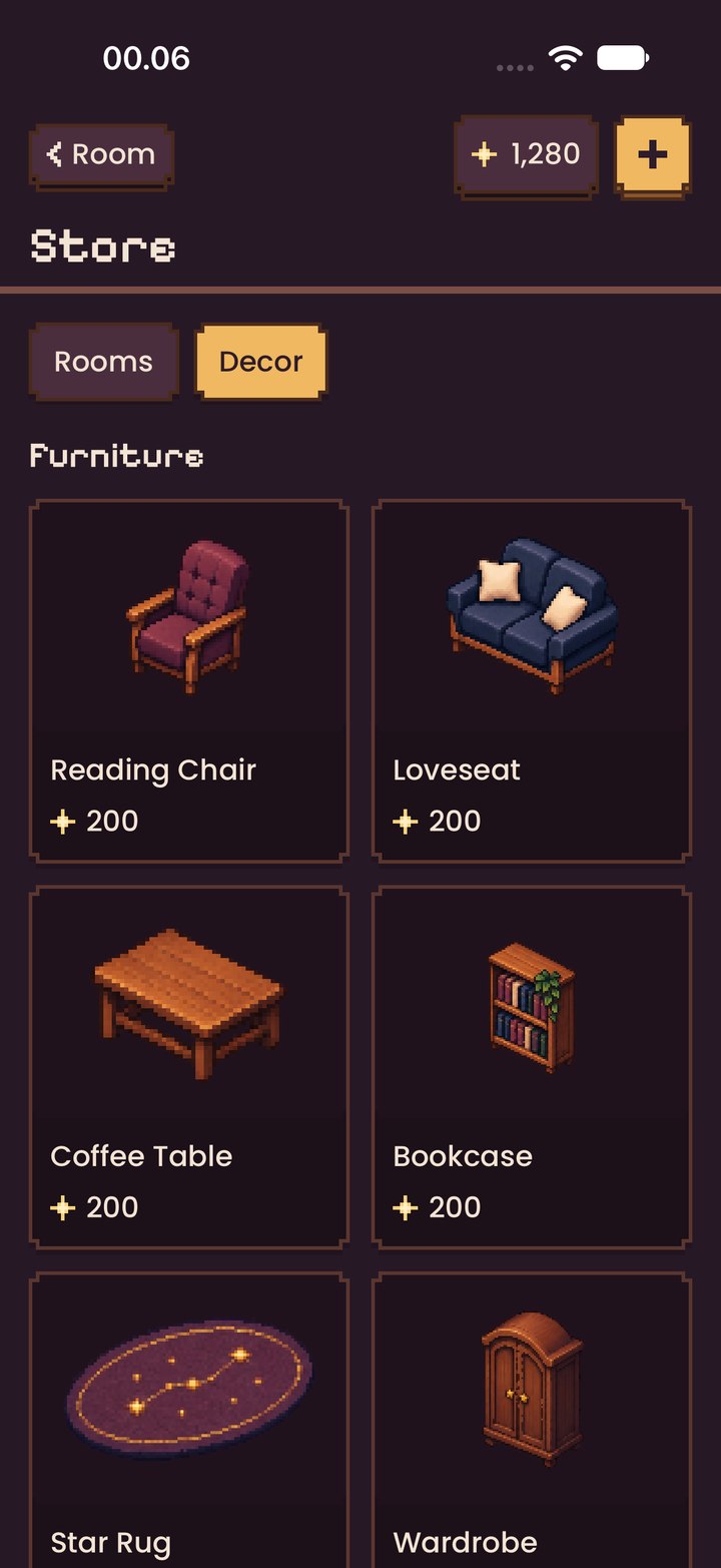
PlaceHeader(title) { trailing }back · back + one action · Save · balance
Every place. Back on the left, at most one action on the right, the name in title under them, then the 4 pt wood rail.
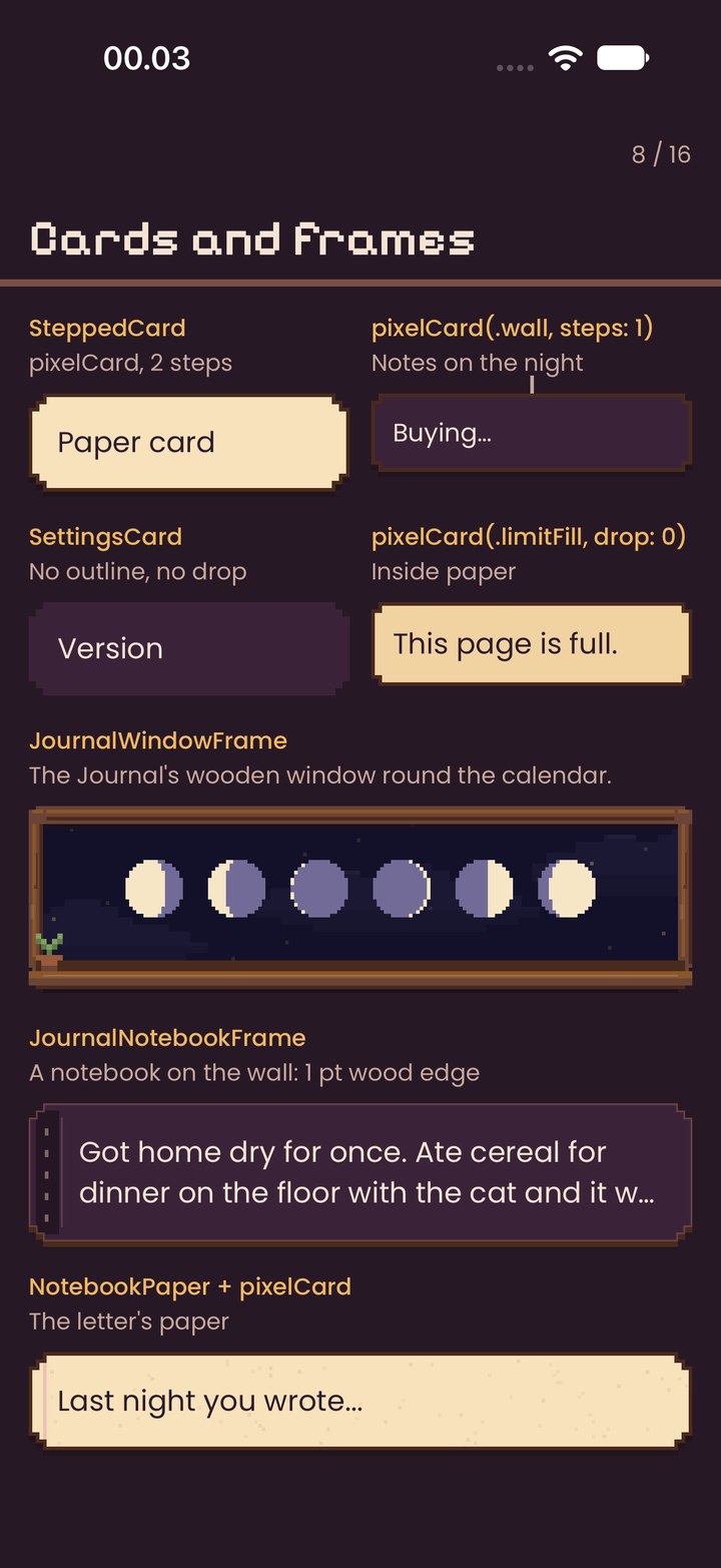
pixelCard / SteppedCardstepped 4 pt corners (1 or 2 steps), 2 pt dark-wood outline, 3 pt hard drop
Every card, sheet, toast and popup. Paper fill on the night for reading; wall fill for notes.
SettingsCardwall fill, 2 steps
Groups of rows in Settings and Reminder.
JournalWindowFrame · JournalNotebookFramewooden window with sill trinkets; notebook with stitched spine
The Journal's calendar and its notebook only.
NotebookPaperruled lines and fibre specks
Under letters and the writer's page.
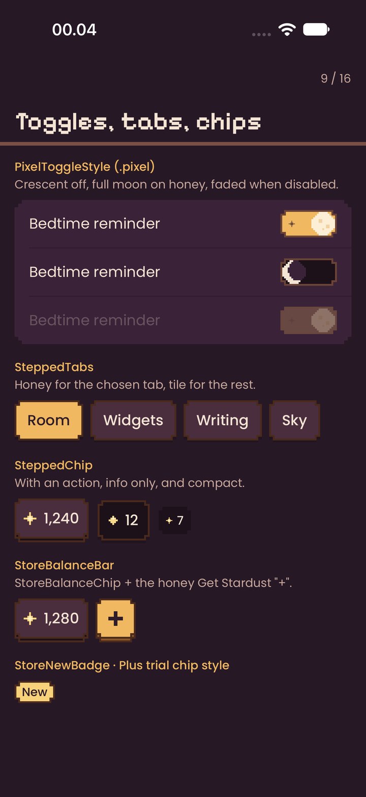
PixelToggleStyle (.pixel)off: crescent on deep; on: full moon on honey with a star; disabled faded; a sparkle burst and a haptic on change
Every on/off setting.
SteppedTabschosen: honey with ink; others: tile with cream
Switching shelves of one place (Store, Decorate, You).
SteppedChipwith an action (ghost), info only, compact
A small icon and a value: the balance, the week.
StoreBalanceBarbalance chip + honey “+” when packs can be sold
Top right of Store and Get Stardust.
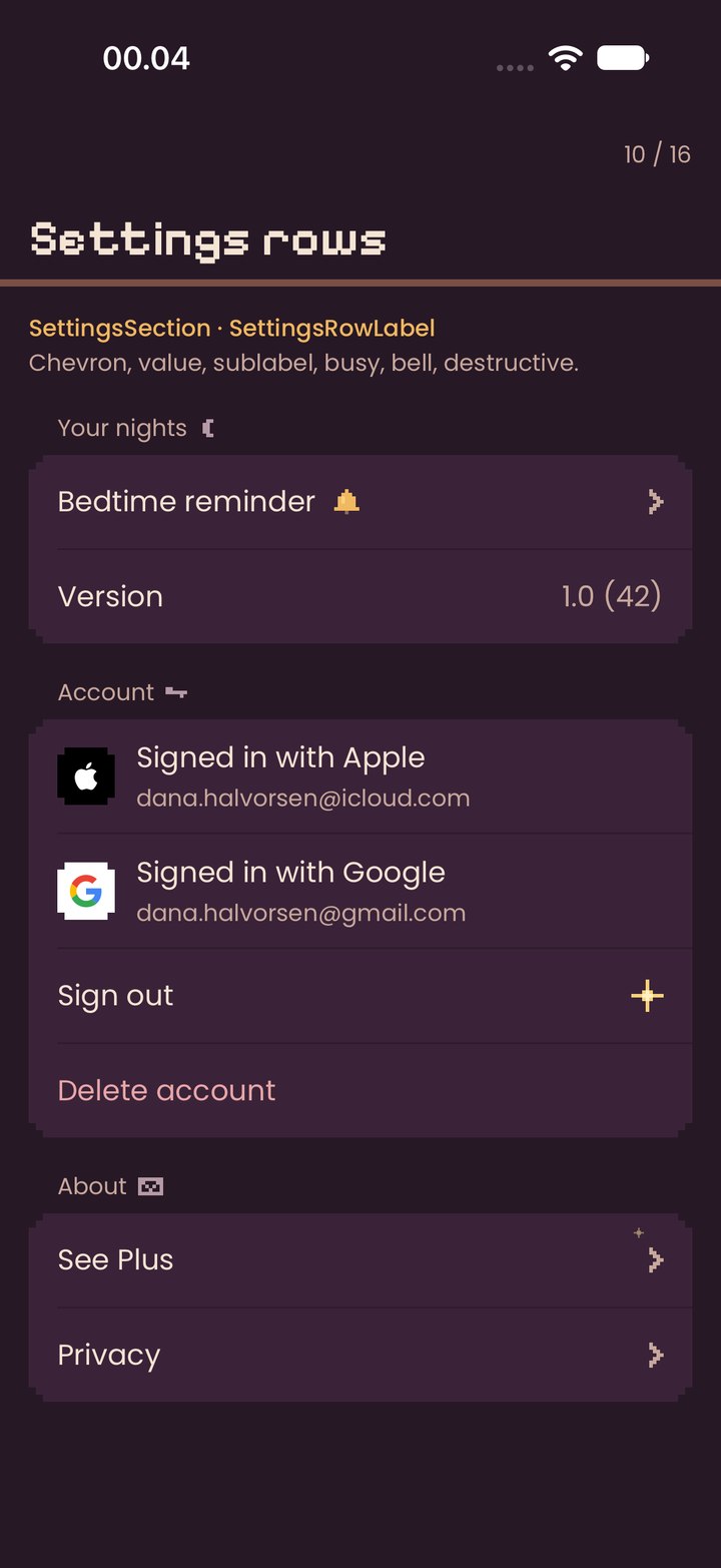
SettingsSection · SettingsRowLabelchevron · value · sublabel with provider mark · busy spinner · bell · destructive (pillow) · See Plus sparkles
One row per choice, 52 pt tall; the chevron hops forward when pressed.
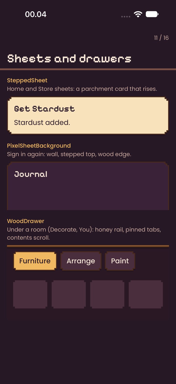
SteppedSheeta parchment card that rises 24 pt into place
Home and Store sheets: balance, buy moments.
PixelSheetBackgroundwall with stepped top and wood edge
Full-height sheets on the night (Sign in again).
WoodDrawerhoney rail, pinned tabs, contents fade under them
Under a room you are changing: Decorate and You.
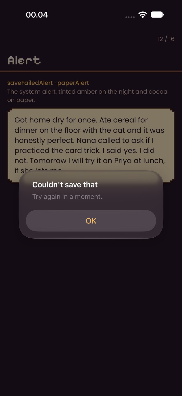
paperAlert / saveFailedAlertthe system alert, buttons in amber on the night and cocoa on paper
Only to confirm something that can't be undone, or when saving failed. Offers arrive as letters, never pop-ups.
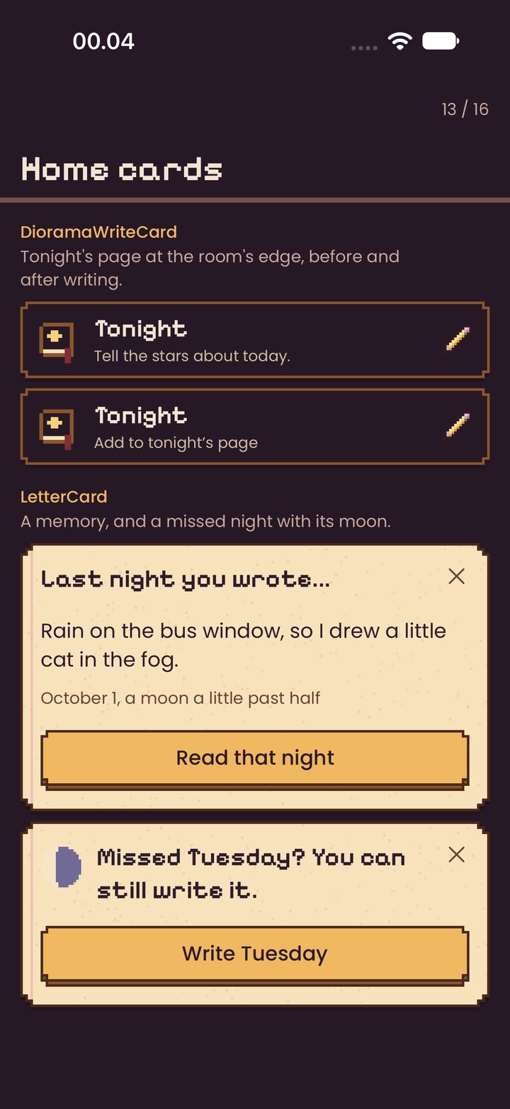
DioramaWriteCardbefore writing (“Write tonight's page”) · after (“Tonight's page”)
Tonight's book at the room's edge, always in thumb reach.
LetterCarda memory with its words and moon line · a missed night with its moon · a quiet note
Anything Asterie wants to tell you arrives as a letter in the room, with one action and a close.
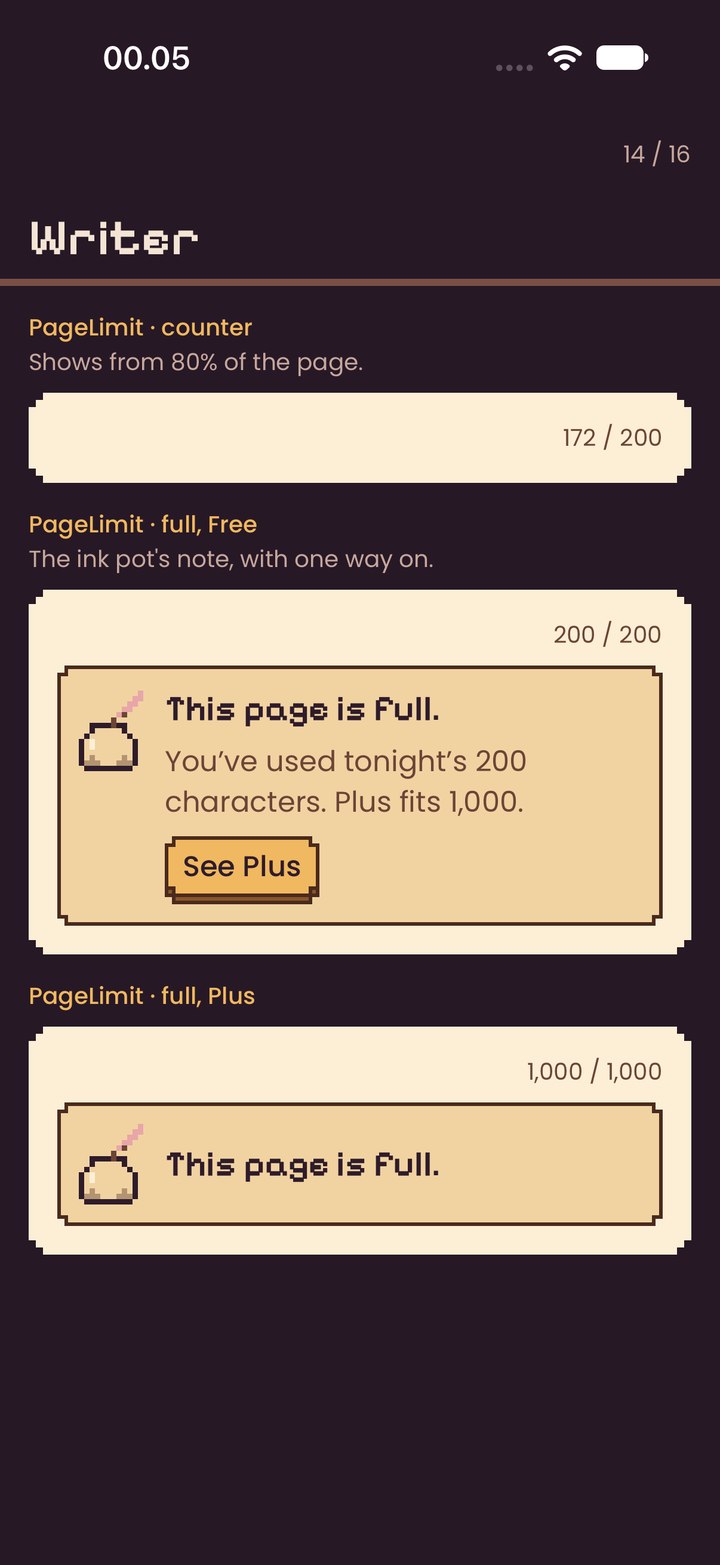
PageLimitcounter from 80% (172 / 200) · full on Free with See Plus · full on Plus
Under the words in the writer: the ink pot says the page is full.
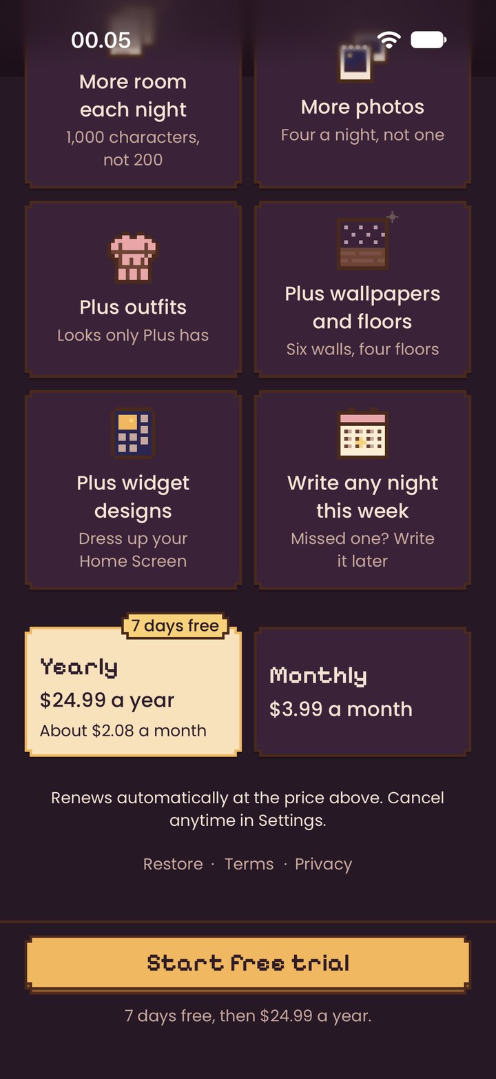
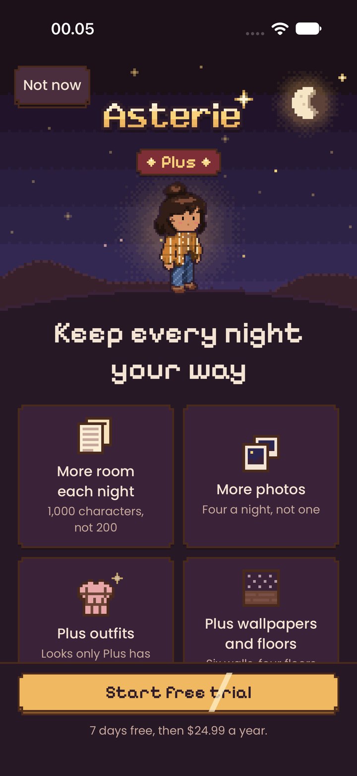
Benefit tilewall card, icon with a twinkle, title in body medium, line in caption
What Plus adds, two to a row. Drawn inside PlusPaywallView.
Plan cardchosen: parchment with an amber outline and ink words; other: wall; trial chip in star
Choosing yearly or monthly. Drawn inside PlusPaywallView.
PlusBenefitIcon(index:)14 × 14 cells at 3 pt
One per benefit, on Plus and in letters about Plus.
The room is the app. A tiny isometric bedroom at night, drawn on a strict pixel grid and lit from inside.
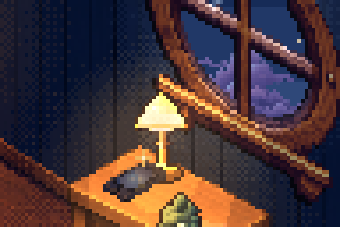
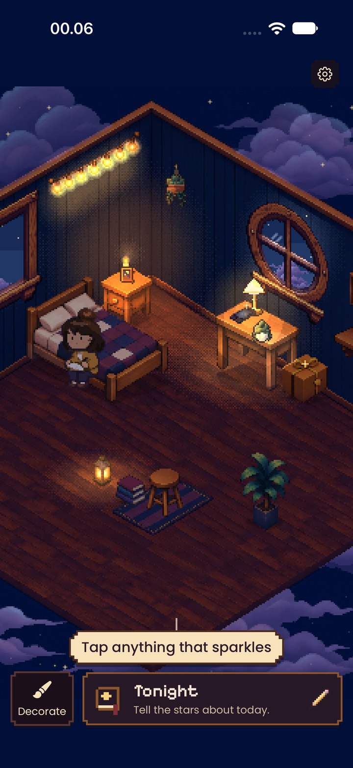
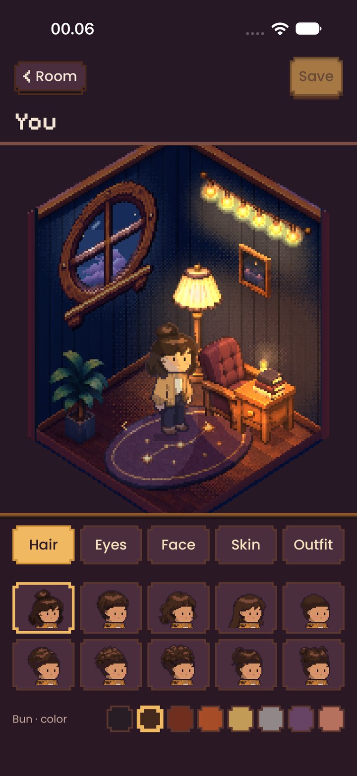
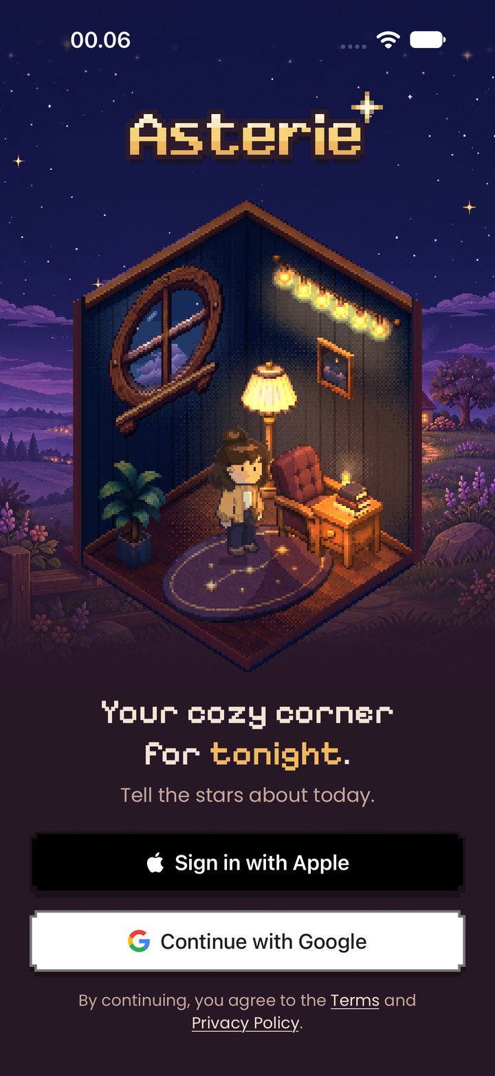
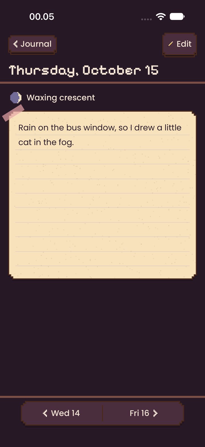
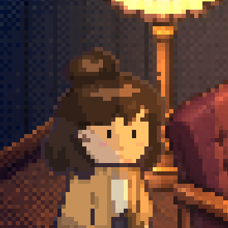
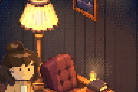
Pixel art moves like pixel art: in steps, twelve times a second. Interface eases; the world ticks.
| Art | CozyMotion.tick = 1/12 s. Halos breathe in 4–6 steps; sparkles twinkle off most of the time, then flash; the spinner turns through four frames. |
|---|---|
| Interface | CozyMotion.spring (0.42 s, 0.68) for sheets, cards, toasts; .pop for small things landing; .swing for hanging tags. Buttons sink 4 pt in 0.05 s and three honey pixels hop off on release. |
| Reduce Motion | Loops are left out or hold one frame (the spinner's first, the landscape's first, glows lit mid-breath). Places cross-fade instead of zooming. Sheets fade instead of rising. |
| What pauses | The room stops when you leave Home, open the writer or a sheet, lock the app, or leave it. The arrival landscape holds while a sign-in is under way. The Plus night holds during a purchase and off screen. |
Asterie talks to the person holding the phone, in the room's own words.
| Before | After | Why | |
|---|---|---|---|
| Stardust is resting for now. Your balance and everything you own are safe. | → | Stardust is resting for now. Keep writing to fill your jar. | Says what to do next, not that things are safe. |
| Kept. Goodnight, Thursday. | → | Goodnight, Thursday. | The moment shows it is saved; “kept” is our word, not yours. |
| Seven nights kept. | → | Seven stars in your sky. | The milestone belongs to the world. |
| Your changes are still here. | → | Check your connection and try again. | An action instead of reassurance. |
| The price or catalog changed. Review the current price before buying. | → | The price changed. Check it, then buy again. | Plain words; no “catalog”. |
| It’s yours / to keep | → | Place it / in your room | The next step, not a promise. |
| Replace saved words | → | Save my version | The verb is Save. |
| Open Asterie to share your room | → | Tap to bring your room here. | An action, and the app never types its own name. |
Measured from the code, in points.
PlaceHeader: back left, one action right, the name below, then the rail.
Corners step in 4 pt (one step for chips, rows and buttons, two for cards and sheets). Outline 2 pt dark wood #4A2A1C. Hard drop 3 pt in deep at 55%.
At least 44 pt tall (38 drawn when short, tap area still 44). Face 8 pt × 16 pt padding (10 when compact). Base 4 pt below.
52 pt minimum, 16 pt sides, 10 pt top and bottom. Dividers 1 pt inset 16 pt. Section caption 6 pt above its card, 14 pt between sections.
Pages use 16 pt sides (Plus 20). Steps used: 4 · 6 · 8 · 10 · 12 · 14 · 16 · 20 · 24.
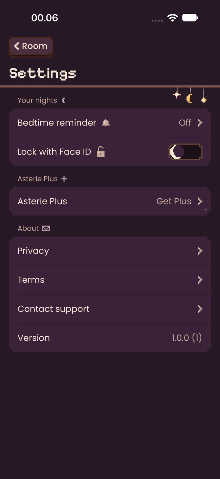
Built from design-site/build.py. Screens come from ComponentGalleryWalk; colours from the Swift theme.
Rebuild after a visual change so the kit and the app stay the same thing.